Showing posts with label Blackletter. Show all posts

Thursday, June 27, 2013

Smoke Gets in Your Eyes


Just when I think I've seen it all...along comes a client who wants to present cutting boards and cheese stones to winners of a local tennis tournament! Four. Of each.

After practicing on scrap wood, I did the lettering on paper, then transferred it in chalk before taking the woodburning tool to it.


The first pass was a little funky. Although I had sanded and steel-wooled the area lightly, there was still some kind of wax or oil on the surface.


 After sanding and steel-wooling again, a second pass gave a little more definition.


The cheese stones were a little easier--and more forgiving. Slate is so soft I could just scratch off any errant blobs of paint and after wiping with a damp paper towel, it didn't show at all. Since the surface was rather uneven, I stuck with monoline and used a new-to-me Montana Acrylic marker (refillable!) with an extra-fine tip.


Certainly not perfect, but way more useful than trophies!

Friday, July 13, 2012

Calligraphy Northwest: Dynamic Duo

Julian Waters & Carl Rohrs, June 2012
Last post I mentioned that Reed College's Eliot Hall was where Fr. Edward Catich cut the lintel stones, and Lloyd Reynolds taught his calligraphy classes back in the day.
Eliot Hall, Reed College, Portland OR
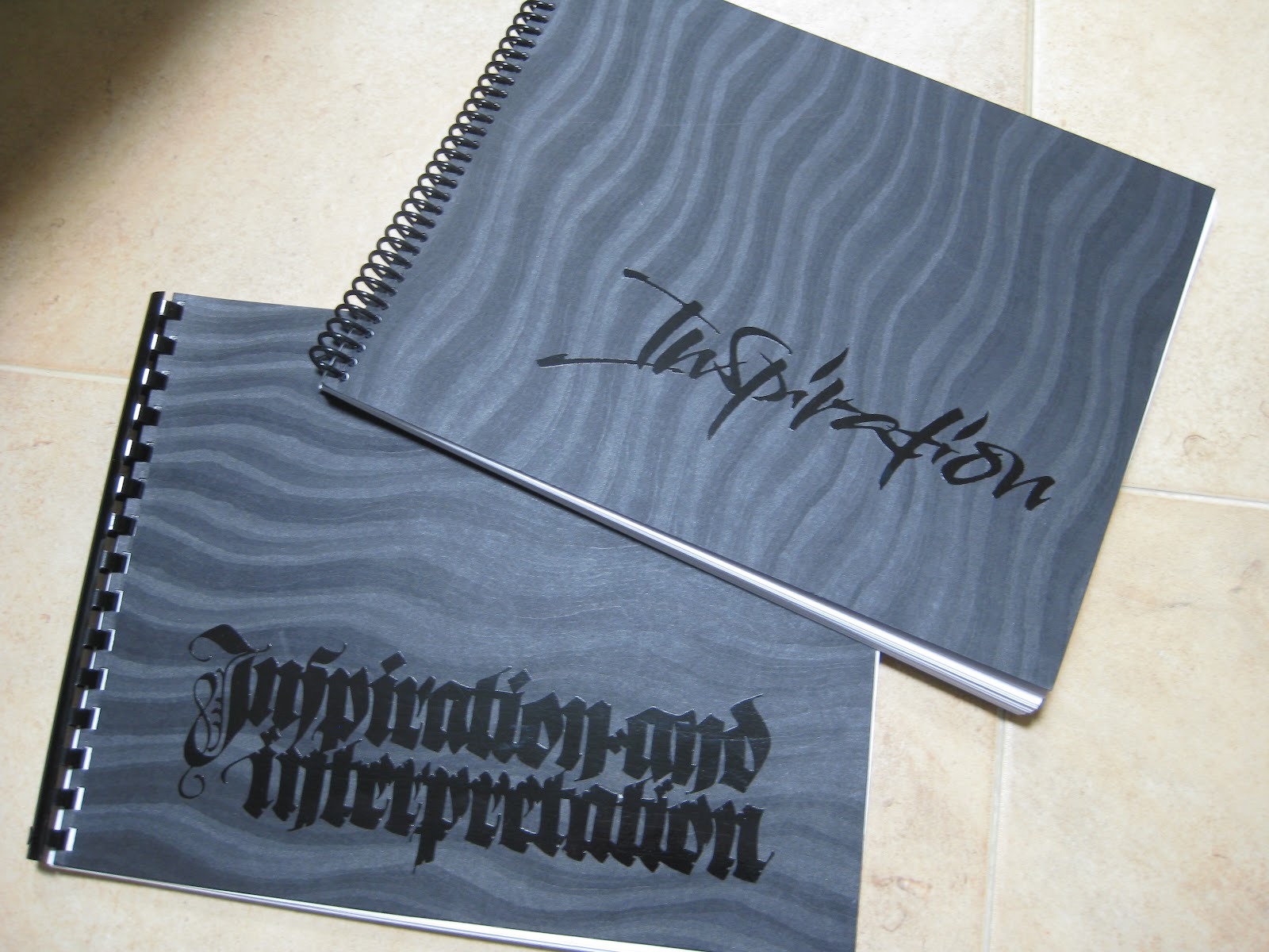
So there, in the very same lecture hall---well, half of it, the other half is now the college president's office--two present-day calligraphic luminaries held forth with a course titled "20th Century Inspirations and 21st Century Techniques" during the week of Calligraphy Northwest in June.  Julian Waters and Carl Rohrs started out by giving us what clearly had been a labor of love for each of them:  a total of 248 pages, bound in two volumes, of their own work alongside that of their "inspirateurs", some familiar, some obscure (at least to me). There is enough material here for a lifetime of study!  If my house ever catches fire, I know what I'll be grabbing on the way out the door!
Workbooks by Carl Rohrs (top) &  Julian Waters (bottom) for CNW
Most of the time I was so busy listening, observing, absorbing and experimenting that I took very few photos.  To be honest, a lot of it is just now sinking in.
Julian demos while Carl comments
Contrast!

It's all in the details!

This wasn't a product-oriented class, but a rather stream-of-consciousness romp through big ideas and tiny details--which seem now either too vast or too small to write about here.  In what they had predicted would be a "somewhat improvisatory" presentation, it was fascinating to listen to Carl & Julian's banter, filled with seriously encyclopedic knowledge of fonts and all things calligraphic. For example, did you know that Rudolf Koch had designed minuscules for his1920s Neuland typeface, but they were abandoned?  Here's my attempt at approximation:


We worked with broad nib, automatic pen, folded nib, ruling pen, flat brush and pointed brush. Here we were trying to eliminate as much negative space as possible in our blackletter:


That afternoon we switched to pointed brush and my head almost exploded!  I won't trouble you with illustrations of my feeble attempts.

At the end of the week there was a "show and share" in the dining hall.  What a feast!


I apologize for the lack of attribution--way too many to keep track of.

It was announced that in addition to the 2013 conference at Colorado College next summer, the 2015 conference will take place in the Bay Area!  Save the dates!

Thursday, March 1, 2012

Top Brass

Finished size approx. 12" X 16"
The GRAMMY-nominated Bay Brass (has a nice ring to it, does it not?) had organized a concert to honor the recently-retired repairman who has kept their horns--and those of most brass players in the area--in working condition for many years, and to benefit a music camp scholarship fund in his name.  Last-minute scroll request + free design reign + school vacation week = BLISS!  On break from my day job (only job, actually...), I barely left the studio for ten days;  my sweet husband kept me supplied with liquid and solid refreshment while I put to use some of the techniques I have learned in classes these last several years!

Saturday, December 3, 2011

My Brush with Greatness


What is it about white on black that makes lettering look better than it is?  Kind of like candlelight that way.


Earlier this year I was asked to make some signs for a local chamber ensemble, the Bay Brass.  They were performing at the San Francisco Conservatory of Music to celebrate the release of their CD "Sound the Bells", a labor of love eight years in the making. 


Little did I know at the time that the CD would go on to be nominated for a Grammy! Since my husband plays in the group, my first thought was--do we get to go to the awards?!?  But I think the classical small ensemble awards are probably handed out the night before, maybe in the basement, or the parking lot...drive-by...oh well.  Lady Gaga will have to wait to meet me.

Anyway, you can hear samples of, and/or purchase, this amazing recording here, along with their Christmas album which is awesome and has been a favorite for over ten years.  Be sure to mention you know their calligrapher...

Tuesday, July 5, 2011

L Cake


I don't know anything about the flavors in this cake, since I delivered the stencil to Wendy just before dashing out of town!  I believe the top is a white chocolate disk, and the stenciling is done in green and gold lustre dust.  It is our smallest one yet.

Monday, May 9, 2011

Border Trouble

I recently learned the expression "border trouble", in this case referring not to immigration---nor to illuminated borders, like the one above---but rather to the sometimes-daunting obstacle between the idea for a piece and the point at which it begins to take shape.  Since I sometimes struggle mightily to move through that region, it helps me to think of it as just a transition, kind of a bothersome ordeal one has to go through to move into the pleasure on working on the piece once it starts to come to life, not to mention once it is finished.

It's school fundraiser season once again and I created this piece to raise some money for a good cause.  Artwork doesn't always do well in a silent auction but this was displayed nicely and went for a pretty penny!  The border outline came from the fabulous collection of the Graphics Fairy (you really need to go to that site, and bookmark it!);  I was able to take a little shortcut and print it onto tracing paper (rather than actually tracing it) and then transferred it to Arches 140 lb hot press with Armenian bole.

Because of the nature of the quote, I used more colors than I usually would have in the border.  The ink is Pelikan (with some powdered gum arabic added);  the rest of the design is gouache, pen, and 23K gold leaf.  I used a [left-handed] Brause 1.5mm nib;  the image is about 7.5" X 10.5".  I used my Logan Compact Mat Cutter (which has come in handy more times than I can count) to cut the mat, then popped it into a frame I picked up at Michael's half-price.  Ta-dah!

Monday, April 11, 2011

Lemon Blackletter: Tim's Cake


I didn't get to see/taste this one in person since I was on my way back to beautiful Enders Island;  I dropped off the finished stencil to Wendy on my way out of town.  I do know that there was lemon, marzipan, buttercream, almonds and limoncello involved...yum...

Saturday, March 26, 2011

Silk Purse from Sow's Ear


So after four-plus years of Blackletter classes at Atelier Gargoyle, I had acquired an impressive pile of butcher paper practice sheets that it seemed wrong to throw away.  One of my classmates had suggested I use them for wrapping paper, which was fun and different--very cute when tied with string.  For some reason I thought to grab a few sheets as I went out the door to an evening collage class with the inimitable Anna Corba, incongruously but delightfully being held at Knitterly, a favorite local yarn store.  We were provided with kits and lots of boxes of ephemera to dig through, and I thought my walnut-inked specimens were a nice contrast to the image elements.  (Don't look too closely at the letterforms, Linnea & Ward--the sheets are really old, okay?  That's my story anyway.)


We made collages on two pieces of matboard, then coated them with melted beeswax, which gave them surprising depth and dimension.  The covers were assembled with the notebook elements and bound together with ribbon.


 A fun project and a nice mid-week escape!

Monday, December 13, 2010

Bye Bye Blackletter

The names of everyone who has ever attended a Black Sabbath class
by Ward Dunham
It was a bittersweet event.  On Saturday, December 4, students and friends of Ward Dunham & Linnea Lundquist gathered to celebrate the end of four-and-a-half years of "Black Sabbath" blackletter classes in their San Francisco studio, Atelier Gargoyle.  Those of us lucky enough to attend these monthly Saturday sessions were expertly and enthusiastically schooled in Textura, Johnstonian Italic, Uncial, Batarde, and other related topics by two exceptional calligraphers who happen to be a couple and, often, a comedy duo.


There was food, including cupcakes from the wonderful Jasmine Rae Bakery, who have kept us in yummy gingerbread and other delectables these last few years.


Look closely...those are fondant Brause pen nibs!  Good enough to eat, and we did.


Ward tended bar, offering his signature Hot Apple Pie adult beverage...


...while Linnea helped everyone stock up on supplies from the shop.


The exhibit of the students' final projects, beautifully displayed on the studio walls and tables, was varied and awe-inspiring!


Here is a closer look at a few of the pieces for which the photos came out reasonably well.  There were so many wonderful ones!

Meredith Jane Klein
Paul Costanzo


David Brookes

Patricia Coltrin

Jessie Evans
Helen Fung 
Bonnie Noehr
Dean Robino
Raoul Martinez
There were awards, speeches, and heartfelt tributes, followed by lively conversation and merrymaking!


Ward made sure we all had the contact information for their new abode in Half Moon Bay...


...and Linnea, along with the rest of us, shed a few tears.


But it has been a great run, and all of us who participated are richer for it.  Black Sabbath has been an important part of the San Francisco calligraphy community, and will be sorely missed.  Thank you, Ward & Linnea!  It has been a pleasure and a privilege.

LinkWithin

Related Posts with Thumbnails