Saturday, December 18, 2010

Everything Old is New Again


I was walking through West Elm on my way to somewhere else when I spotted these dishes and snapped some photos with my phone.  West Elm is a little too trendy for me, but if Offhand Flourishing is hip, I guess I'm cooler than I thought!  I haven't sleuthed it but the bird looks suspiciously like something out of E. A. Lupfer's  Ornate Pictorial Calligraphy.

The deer and the horse don't have the same graceful thicks and thins, but the idea is definitely there.


I didn't notice it in the store, but according to their website they also have a snowflake, mandala-like design:
 West Elm photo
So I guess it should come as no surprise that Pottery Barn, which is also owned by Williams-Sonoma, has also used calligraphy in their holiday bedding design.

Pottery Barn photo
In this case the flourishings are relegated to the background, but I think they really make the design:

Pottery Barn photo
Pottery Barn photo
And for the truly obsessed dedicated, you can complement the ensemble with scribbly sheets!  Couldn't name the hand, but it looks to be French.

Pottery Barn photo
Pottery Barn photo
So I wondered if this was a running theme in the corporation, and headed to the Williams-Sonoma website.  Sure enough.  Napkins, tablecloths, mugs, glasses, plates, and even a cookie jar with calligraphy--some recognizably Spencerian--woven in.  We're taking over!

Williams-Sonoma photo


Disclaimer:  West Elm, Pottery Barn, and Williams-Sonoma have no idea who I am;  just thought these were fun and wanted to pass them along.

Monday, December 13, 2010

Bye Bye Blackletter

The names of everyone who has ever attended a Black Sabbath class
by Ward Dunham
It was a bittersweet event.  On Saturday, December 4, students and friends of Ward Dunham & Linnea Lundquist gathered to celebrate the end of four-and-a-half years of "Black Sabbath" blackletter classes in their San Francisco studio, Atelier Gargoyle.  Those of us lucky enough to attend these monthly Saturday sessions were expertly and enthusiastically schooled in Textura, Johnstonian Italic, Uncial, Batarde, and other related topics by two exceptional calligraphers who happen to be a couple and, often, a comedy duo.


There was food, including cupcakes from the wonderful Jasmine Rae Bakery, who have kept us in yummy gingerbread and other delectables these last few years.


Look closely...those are fondant Brause pen nibs!  Good enough to eat, and we did.


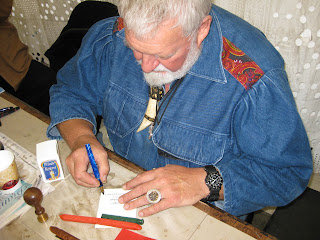
Ward tended bar, offering his signature Hot Apple Pie adult beverage...


...while Linnea helped everyone stock up on supplies from the shop.


The exhibit of the students' final projects, beautifully displayed on the studio walls and tables, was varied and awe-inspiring!


Here is a closer look at a few of the pieces for which the photos came out reasonably well.  There were so many wonderful ones!

Meredith Jane Klein
Paul Costanzo


David Brookes

Patricia Coltrin

Jessie Evans
Helen Fung 
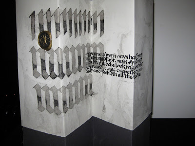
Bonnie Noehr
Dean Robino
Raoul Martinez
There were awards, speeches, and heartfelt tributes, followed by lively conversation and merrymaking!


Ward made sure we all had the contact information for their new abode in Half Moon Bay...


...and Linnea, along with the rest of us, shed a few tears.


But it has been a great run, and all of us who participated are richer for it.  Black Sabbath has been an important part of the San Francisco calligraphy community, and will be sorely missed.  Thank you, Ward & Linnea!  It has been a pleasure and a privilege.

Sunday, December 5, 2010

NO8DO


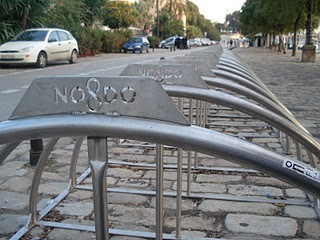
Before visiting my son in Spain last month I had read about the city of Sevilla's cryptic official symbol, which dates to the 13th century.  I was delighted on my first morning there to come across the lovely calligraphic (and I think, letterpress) rendition above.  And as promised in the guidebooks, it was everywhere.  

On Christopher Columbus' tomb in the cathedral:


At the Plaza de EspaƱa:


On the sidewalks:


On the utility trucks:


And just about everywhere you look, in some delightful rendition.


So what does it mean?  The symbol's history involves Alfonso the Wise (the "Scholar King") and Sevilla's singular loyalty to him in the face of his son Sancho's attempted overthrow. What seems to be an "8" is a representation of a skein of wool, or madeja.  The play on words is a contraction of "No me ha dejado", or "She [Seville] has not abandoned me." When spoken, the "me ha" typically is run together, making "NO-m[eh]adeja-DO".  A little confusing, but charming nonetheless!  For the full story, click here and scroll down to "Motto".

Thursday, December 2, 2010

Christmas Comes Early


I don't know about you, but for me the word "clipart" has the connotation of fairly simple, cartoonish images that really are not of much use in the calligraphic world.  But today I am positively swooning over the discovery of University of South Florida's Center for Instructional Technology's Clipart ETC collection! 

At first glance their logo, an ampersand superimposed over a map of Florida, is a good sign--but does not even compare with the riches to come.  There are 60,000 pieces of free, mostly antique black-and-white clipart, and more are being added every week.  Categories include Decorative Letters (just begging to be illuminated!),  Complete Alphabets, Art (including Celtic and other ornaments), Borders (corner, edge, and full page) plus vines, doodads and tailpieces.   Each is offered in three JPEG or GIF sizes and a downloadable 240 dpi TIFF for printing. The database is easily searchable and will yield many treasures!


And best of all, you can use up to fifty of them in a single project without special permission if it is non-commercial or educational (and "not obscene or scandalous"---so tone it down, you wild and crazy scribes). It's a goldmine!

All clipart courtesy FCIT

Thursday, November 18, 2010

Grace Under Pressure

"Grace", original size approximately  8" X 18"
What is it about a looming deadline that brings clarity to our thinking?  This is a piece I had been mulling over for at least a year, occasionally pulling out the quotation and fooling around with it.  Then Linnea Lundquist & Ward Dunham announced they would be closing their wonderful studio, Atelier Gargoyle, on December 4th with an all-day party and show of their students' work.  This was the incentive I needed, and I knew it had to get done and delivered this week since I would be out of town most of the two weeks before the celebration.


It truly has been a gift to have access to Ward & Linnea's wisdom and expertise these last four-and-a-half years at their monthly Saturday "Black Sabbath" classes in San Francisco where we explored Textura, Batarde, Uncial, Johnstonian Italic (aka Pointed Gothic)--in short, all things Blackletter.  Very early on, after Ward made some jokingly snide remarks about Pointed Pen People, I sent them a New Years card I had designed in Spencerian, knowing that I was "outing" myself as a PPP.  They both responded with one of their famous postcards, enthusiastically encouraging me to work with the two styles "for ultimate contrast", and encouraging me to "look to your Bickham".  "Be the one," wrote Linnea, "to combine the two with panache."  I've never forgotten that, and have always been grateful.


At every Black Sabbath class we painstakingly ground our black Chinese stick ink, and occasionally used Chinese vermillion for electric red accents.  With this piece I wanted to stay faithful to that.  I had originally planned to illuminate the "G" but in looking at my roughs, Linnea encouraged me to keep it simpler.  The diamonds on the G and B are gilded.

When Sheila Waters was in town earlier in the year, she had shown us her latest work on Pergamanata paper, singing its praises and vellum-like qualities, in particular the easy correctability.  I decided then and there it must be the paper for me, and although it took some getting used to, I am now a devoted fan.  It is not at all as mottled looking as in the scan above, and it seemed able to take endless scraping and erasures without complaint.


As I said, there was a deadline involved and with understanding friends and a supportive spouse, I holed up in the studio for days, finally coming through with a piece I could live with, then cutting mats for it and popping it into a frame for the show.  I'm looking forward to seeing my classmates' work and getting together one last time;  we've all come a long way in 4+ years and there is some amazing and varied talent in the group.  It's been a great run and I'm very sad it's over.

LinkWithin

Related Posts with Thumbnails