Showing posts with label illumination. Show all posts

Friday, April 22, 2016

Talk to the Animals

© Jody Meese 2015
Bristol board, gouache, 23k gold leaf,
Finetec 'Evening Gold', Moon Palace Sumi Ink

This one was hard to photograph, but the colors are pretty true in the scan above. It was a commission to be given as a gift to a recent veterinary school graduate, to hang in her new office.


The gold is tooled with the traditional pattern that I think of as curled fern fronds.


I wanted the animals to be subtle, so I "hid" them in the border. Best of luck to the newly-minted veterinarian!


Sunday, April 3, 2016

A is for Animal

Gouache, colored pencil, gold leaf, Finetec on Bristol board
Here's a sneak peek at a commission in progress!

Friday, March 18, 2016

Rinka Ronka Reprise

Goauche, gold leaf, Spectralite, Finetec, ink, colored pencils
and crystals on Bristol board

It's auction season again and I was asked to donate a piece to the school where I worked for 25 years, until I 'retired' last June. If you follow this blog you may remember that last year, the curse was broken and not only did my three little pieces raise some serious money, there were people who were willing to match the highest bids so I did two more. This one is essentially the same design as last year, with different colors.

This is the song the children (and their parents!) sing each morning as they file into the classroom. A choir of angels!

Friday, February 19, 2016

Sweet Music

Quote by Stephen Sondheim, Artwork by Jody Meese
Gouache, Spectralite, gold leaf, colored pencils, "jewels", Pitt marker

 These little 5"X5" illuminated pieces (8"X8" framed) are so much fun to do, and perfect items for charity auctions. This one was for the Marin Girls' Chorus. My daughter, a former chorus member, sits on the Board.


Lucky for me, I had help with gilding from visiting calligraphy royalty, Harvest Crittenden! She also offered valuable critique and encouragement.


The mat is some marbled paper I picked up in town...after this photo was taken, I used a ruling pen to add a gold line about 1/4" from the inner edge.

Always fun to contribute to a worthy cause with something I enjoy creating!

Sunday, March 15, 2015

Triple Threat


As a mom and school director, I have probably been involved in 25 or 30 charity auctions for schools and sports teams. Over the years it has become painfully clear I have absolutely no sense of what will attract the interest of bidders. Once I copied an item (non-calligraphic) I had seen go for $600 a few years before...then watched it go for 60 bucks, probably less than it cost to make it. Another time I donated anonymously--still no dice. I've even bought back my own stuff to be sure it didn't get tossed! In other words, I am the Kiss of Death (KOD) for auction items.

But I'm giving it one more shot this year! I've chosen three verses that are special to the children and known to the parents at the school, and illuminated the heck out of them. Gold leaf, crystals, Spectralite, Finetec, the works! I figure even if these babies don't go for much, I sure had a great time making them. Each is a little less than 5"x5", and I popped them into 8" x 8" frames.


Please hold a good thought that the KOD curse has lifted, and that these find good homes and raise some golden coins for the magical Mountain School!


Update 3/29/15: There were bidding wars and these puppies raised well over $1K for the school! Yesss! The curse is lifted.

Update 5/15/15: Two families offered to match the top bids on their favorite piece, so now we're over $1900!


Friday, March 6, 2015

Monogram On My Mind


Recently had a visit from a dear friend who showed a gratifying interest in my work in the studio. I wanted to thank her for that, and for other favors received...so hoped she would enjoy a little bit of glitz and bling!


Thursday, August 14, 2014

B is for...


I always leave the annual IAMPETH conference full of enthusiasm and fresh inspiration, ready to experiment and stretch my comfort zone, and this year is no exception. What a week! There is much to tell, but I'll start here: colored pencils! Bob Hurford taught a short evening session class on the topic and I've been playing around with illumination using Prismacolor Premier pencils. Definitely slower than gouache or watercolor, but for me, easier to control! The "B" is an outline by E. E. Marlatt; the gold is Finetec Inca.

Friday, January 24, 2014

The (Second Half of the) Year in Pictures


Some of my designs for Ultimat Vodka Holiday Campaign
One of five San Francisco venues for Ultimat events in November/December
Very special commission
Commission: walnut ink, watercolor and Finetec gold
Zig Posterman pen on chalkboard fabric
Chalk on display board

Tooled gold leaf
JJ Monogram, pen and ink
JLM monogram, pen and ink
CMS monogram, pencil sketch
Gouache, gold leaf, ink on hotpress watercolor
Piece done in Risa Gettler's Visigothic Versals class; ink,
watercolor pencil,  Finetec gold


Sunday, June 30, 2013

Twelve for '13

Longest name I've inscribed on a diploma, or maybe on anything!

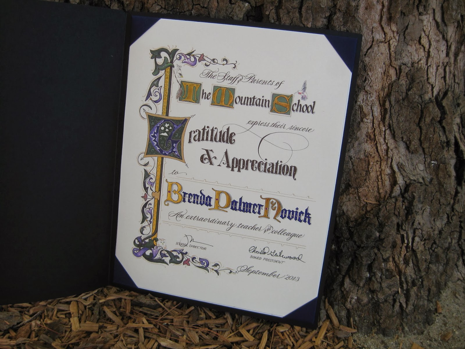
Here is this year's edition of the Marin Waldorf diploma, for which I created and printed the outline, then taught the class parents to paint with gouache and tool the gold. Each year's is a unique design.


Monday, December 24, 2012

Joy to the World!


This project took quite a while to gel, but yesterday it finally came together! I started several weeks ago with an actual scale diagram, taking in to account the television, the cabinet, two framed pieces of art, and even the beam. Oh, the obstacles we face as artists...


The script-y words took a different form--couldn't quite pull off the ribbon look. Of course, with chalk one can keep "fixing" things forever... Unlike the signboards for the school, this is real chalk (not Zig Posterman); my guests tend to be better behaved than the preschoolers. It also doesn't rain inside my house.


My husband kept telling me to add color to the "illuminated" R, but I was curious how far it could go with just black and white. What do you think?


Happy holidays to all, and keep looking for the joy!

Wednesday, June 13, 2012

Sayonara Sylvia


A longtime colleague is departing at the end of this week, and it is bittersweet for her as well as for those of us staying on.  For some time, she has wanted to teach at the same school her children attend--which will significantly simplify her life, we hope--but she has been with us for many years and we all feel like family.

She loves orange, and wears it well.  I wanted to make a going-away card for her that expresses both her favorite hue and the fire within her that makes her so strong and ambitious!  Inktense pencils, lightly brushed with water, give a flame-like feeling.  For the ornamentation, I remembered learning from Harvest Crittenden how lovely it is to combine gold leaf and shell gold (see the halo in this post);  this is the "poor man's version" with gold leaf over Instacoll, and painted Finetec gold and silver.  I love the dimensional look it gives!

The shadows on the Sickels lettering are Zig gray suede (a heretofore under-appreciated brush pen that has patiently awaited attention in my studio) and HB graphite;  outlining is done with a fine-tip Pitt pen.  The paper is Crane's correspondence card, mounted on a piece of old greeting card (cut with deckle scissors), a piece of metallic gold (ditto), and a Fabriano Medioevalis card.  The final touch was a scattering of random crystals from Michaels, glued on.  Hope she likes it!

Tuesday, June 5, 2012

Engrossed in Graduation

Once again I was delighted to be asked to design a diploma for the graduating class of the school my kids attended oh-so-long-ago, and to work with the parents on the illumination while the eighth graders were off on their class trip.  The Engrossing Saga I attended last fall was still very much with me, and I went for a kind of turn-of-the-twentieth century look with a twist: part color, part black-and-white.  

The idea is to keep it simple enough that the group can complete the painting in a three-to-four-hour crash course in engrossing.  The design was hand-drawn (Sickels alphabet), calligraphed (Johnstonian Italic), scanned and cleaned up in Photoshop (both twenty-first century luxuries), and inkjet-printed on New Diploma Parchment, whose praises I must join the chorus and sing!  I inscribed the names in Copperplate with Moon Palace Sumi, chose a gouache palette and mixed the colors.  For the gold we used Spectralite, which held up nicely to burnishing and tooling.  Outlining was done with a fine black Pitt pen, and leaf vein dots with a gold gel pen.


We settled into the classroom for a Sunday afternoon and several hours later...


...nineteen diplomas, ready for signatures!


It always amazes me to think that one could actually make a living as an engrosser back in the day!  If only I'd been born in the 1800s--and male, of course--this would have been the profession I aspired to.  Sigh.

Thursday, March 1, 2012

Top Brass

Finished size approx. 12" X 16"
The GRAMMY-nominated Bay Brass (has a nice ring to it, does it not?) had organized a concert to honor the recently-retired repairman who has kept their horns--and those of most brass players in the area--in working condition for many years, and to benefit a music camp scholarship fund in his name.  Last-minute scroll request + free design reign + school vacation week = BLISS!  On break from my day job (only job, actually...), I barely left the studio for ten days;  my sweet husband kept me supplied with liquid and solid refreshment while I put to use some of the techniques I have learned in classes these last several years!

Monday, May 9, 2011

Border Trouble

I recently learned the expression "border trouble", in this case referring not to immigration---nor to illuminated borders, like the one above---but rather to the sometimes-daunting obstacle between the idea for a piece and the point at which it begins to take shape.  Since I sometimes struggle mightily to move through that region, it helps me to think of it as just a transition, kind of a bothersome ordeal one has to go through to move into the pleasure on working on the piece once it starts to come to life, not to mention once it is finished.

It's school fundraiser season once again and I created this piece to raise some money for a good cause.  Artwork doesn't always do well in a silent auction but this was displayed nicely and went for a pretty penny!  The border outline came from the fabulous collection of the Graphics Fairy (you really need to go to that site, and bookmark it!);  I was able to take a little shortcut and print it onto tracing paper (rather than actually tracing it) and then transferred it to Arches 140 lb hot press with Armenian bole.

Because of the nature of the quote, I used more colors than I usually would have in the border.  The ink is Pelikan (with some powdered gum arabic added);  the rest of the design is gouache, pen, and 23K gold leaf.  I used a [left-handed] Brause 1.5mm nib;  the image is about 7.5" X 10.5".  I used my Logan Compact Mat Cutter (which has come in handy more times than I can count) to cut the mat, then popped it into a frame I picked up at Michael's half-price.  Ta-dah!

LinkWithin

Related Posts with Thumbnails