Showing posts with label gold leaf. Show all posts

Monday, April 25, 2016

Rinka Ronka Redux

©Jody Meese 2016
Another commission, a result of previous iterations of a little ditty sung every morning at the preschool. This time I actually thought to document my process and thought I'd share it here, missteps and all.

Last year I created the first "Rinka Ronka" illumination as a donation to the auction fundraiser...

© Jody Meese 2015
...which led to another...and another...

©Jody Meese 2016
...and then one of the moms asked me to create a piece showing the melody as well as lyrics. Even though (or perhaps because) I have a background in music, I was a bit stumped at the prospect of incorporating the notation into a cohesive piece of engrossing. I sent her two concept sketches (the second one borrowing a border from Angelo Rassu)...


...and she preferred the first, specifically that the lines of music were straight across.

I started working on that design.


I did some gilding with gold and palladium, and used different colors for the notes, but...meh. It just wasn't working for me, so I set it aside.

Eventually, I came across this image of a William Morris tapestry design.

William Morris tapestry
I'm a big fan, and was intrigued by the idea of working on dark paper. I did some sample swatches in gouache and colored pencil on ivy Canson Mi-Teintes paper, and loved the way the colors popped on the deep green background, the gouache (right-hand column) more so than the colored pencil.

William Morris tapestry design
I worked up a sketch making the words larger and the musical notation smaller than the previous design. I planted one of Mr. Morris' fantasy flowering bushes on each side (minus the monster acanthus) and strung the musical staves between them. I tried to compensate for the 'weight' of the treble clefs, time signature, and larger letters on the left by adding more flora on the right, some of it encroaching on the music to fill space in lines with shorter text.

© Jody Meese 2016
I scanned the sketch into Photoshop and cleaned it up a little. I printed it onto Borden & Riley #90 Vellum Sheer Trace, covered the back in white chalk, placed it chalk-side down on the green paper, and began to transfer the design by tracing over it.


It was working fine, though a little messy (not to mention arduous). I had decided to pick up some white Saral transfer paper to use instead (the graphite color didn't show up well enough) when it hit me--I wonder if I could print right onto the green paper? And the answer was yes.


Ready to go! First the Instacoll, three coats to compensate for a little bit of roughness in the paper (even though I used the smoother side)... 


...then the 23k gold leaf...


...then the pale green foundation for the leaves, to set them off from the deep color of the paper.


With a little inspiration from a walk in the neighborhood...


...I started in on the flowers and branches, having lined in the music staff with a Pentel Slicci .08 gold pen.


The melody was next, and then the text.  The leaves, branches and lettering were outlined in black ink.


I wrote the melody first with Sumi, but it wasn't showing up very well, so I went back in with a black Sakura glaze pen, which is both glossy and raised. I think notes kind of look like birds on wires!


I felt the flourishes across the bottom weren't carrying their weight in the design, so I went over them with Kölner Miniatum Ink and applied gold leaf.


All of the text and flourishes were shadow-lined with white pencil...
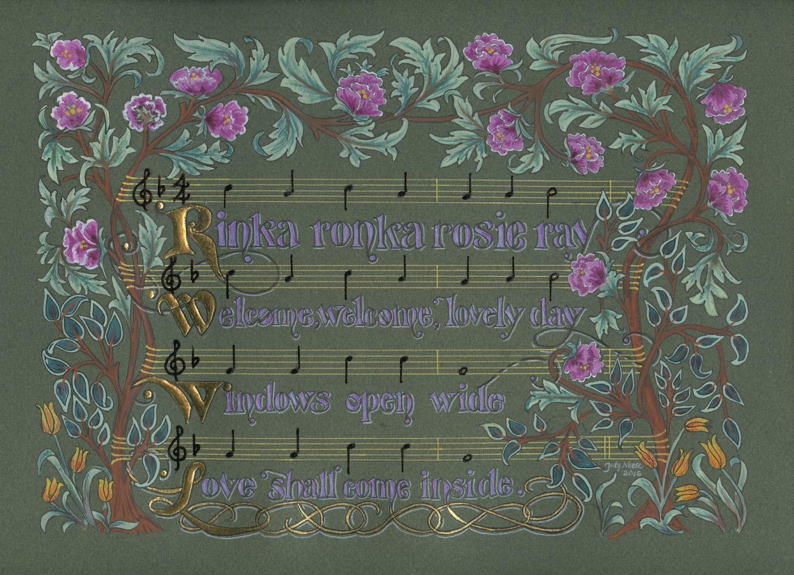

...which I then decided I didn't like, and erased the white pencil on all but the first line...


...which I then decided I didn't like either! So it ended up the way you see it at the top of the page (for now!). I made a decision not to tool the gold (again, for now!) because I didn't think it needed it, and well, you have to stop somewhere.


This project was a delight to work on, and I'm a little sad to see it end. Thanks for following along!

Friday, April 22, 2016

Talk to the Animals

© Jody Meese 2015
Bristol board, gouache, 23k gold leaf,
Finetec 'Evening Gold', Moon Palace Sumi Ink

This one was hard to photograph, but the colors are pretty true in the scan above. It was a commission to be given as a gift to a recent veterinary school graduate, to hang in her new office.


The gold is tooled with the traditional pattern that I think of as curled fern fronds.


I wanted the animals to be subtle, so I "hid" them in the border. Best of luck to the newly-minted veterinarian!


Sunday, April 3, 2016

A is for Animal

Gouache, colored pencil, gold leaf, Finetec on Bristol board
Here's a sneak peek at a commission in progress!

Friday, March 18, 2016

Rinka Ronka Reprise

Goauche, gold leaf, Spectralite, Finetec, ink, colored pencils
and crystals on Bristol board

It's auction season again and I was asked to donate a piece to the school where I worked for 25 years, until I 'retired' last June. If you follow this blog you may remember that last year, the curse was broken and not only did my three little pieces raise some serious money, there were people who were willing to match the highest bids so I did two more. This one is essentially the same design as last year, with different colors.

This is the song the children (and their parents!) sing each morning as they file into the classroom. A choir of angels!

Friday, February 19, 2016

Sweet Music

Quote by Stephen Sondheim, Artwork by Jody Meese
Gouache, Spectralite, gold leaf, colored pencils, "jewels", Pitt marker

 These little 5"X5" illuminated pieces (8"X8" framed) are so much fun to do, and perfect items for charity auctions. This one was for the Marin Girls' Chorus. My daughter, a former chorus member, sits on the Board.


Lucky for me, I had help with gilding from visiting calligraphy royalty, Harvest Crittenden! She also offered valuable critique and encouragement.


The mat is some marbled paper I picked up in town...after this photo was taken, I used a ruling pen to add a gold line about 1/4" from the inner edge.

Always fun to contribute to a worthy cause with something I enjoy creating!

Sunday, March 15, 2015

Triple Threat


As a mom and school director, I have probably been involved in 25 or 30 charity auctions for schools and sports teams. Over the years it has become painfully clear I have absolutely no sense of what will attract the interest of bidders. Once I copied an item (non-calligraphic) I had seen go for $600 a few years before...then watched it go for 60 bucks, probably less than it cost to make it. Another time I donated anonymously--still no dice. I've even bought back my own stuff to be sure it didn't get tossed! In other words, I am the Kiss of Death (KOD) for auction items.

But I'm giving it one more shot this year! I've chosen three verses that are special to the children and known to the parents at the school, and illuminated the heck out of them. Gold leaf, crystals, Spectralite, Finetec, the works! I figure even if these babies don't go for much, I sure had a great time making them. Each is a little less than 5"x5", and I popped them into 8" x 8" frames.


Please hold a good thought that the KOD curse has lifted, and that these find good homes and raise some golden coins for the magical Mountain School!


Update 3/29/15: There were bidding wars and these puppies raised well over $1K for the school! Yesss! The curse is lifted.

Update 5/15/15: Two families offered to match the top bids on their favorite piece, so now we're over $1900!


Friday, March 6, 2015

Monogram On My Mind


Recently had a visit from a dear friend who showed a gratifying interest in my work in the studio. I wanted to thank her for that, and for other favors received...so hoped she would enjoy a little bit of glitz and bling!



Saturday, November 29, 2014

My New Best Friend


So I've been playing around with colored pencils lately, and in one online tutorial it was suggested that one use a "colour shaper" tool (apparently used primarily for making designs in clay) to apply masking fluid, which is gooey gluey sticky stuff to keep the page white wherever it is applied, creating a spot of light on, say, an apple. And since I'm doing a lot of engrossing these days, my first thought was...Instacoll!

Instacoll (used for applying gold leaf), is great stuff but devilish to get out of a brush--also gooey gluey and sticky. Some teachers say to use a good brush and clean it well; others say not to. I have a dedicated brush labeled "Instacoll", but it's not exactly in pristine shape. Not helpful for the old brush control... 

But lo! Enter the Royal Sovereign Colour Shaper! It's a silicone tip (no bristles) and the Instacoll rubs right off it, good as new. It comes in different sizes; the one in the above photo is a #2 but I just bought a #0 (both pictured below) and haven't tried it yet. The tip on either one is fine enough to work  the small details.


Royal Sovereign Ltd. Colour Shapers #2 and #0

Anyone else playing around with these? How are they working for you?


Friday, January 24, 2014

The (Second Half of the) Year in Pictures


Some of my designs for Ultimat Vodka Holiday Campaign
One of five San Francisco venues for Ultimat events in November/December
Very special commission
Commission: walnut ink, watercolor and Finetec gold
Zig Posterman pen on chalkboard fabric
Chalk on display board

Tooled gold leaf
JJ Monogram, pen and ink
JLM monogram, pen and ink
CMS monogram, pencil sketch
Gouache, gold leaf, ink on hotpress watercolor
Piece done in Risa Gettler's Visigothic Versals class; ink,
watercolor pencil,  Finetec gold


LinkWithin

Related Posts with Thumbnails