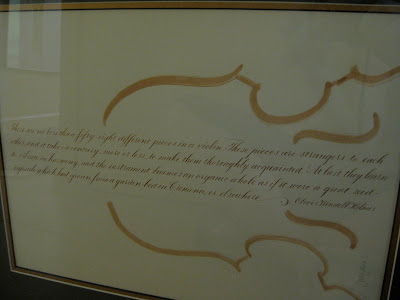
This is a piece I did a while back that continues to puzzle me. I originally designed it and hung it this way:
...which makes it easier to read. In fact, another version of it was published in Somerset Studio magazine in the Fall of '05 and they oriented it this way as well.
But then...I lent it to a show for charity, and when I walked in it had been hung this way:
...which I kind of liked. No so readable, but the texture is nice and maybe more interesting.
What do you think???


i think it's gorgeous any way you look at it!!! interesting to see how someone else interpreted it, though! :))
ReplyDeleteReally nice! You say you're new to calligraphy but your calligraphy is beautiful!
ReplyDeleteThanks so much for your encouragement! Much appreciated.
ReplyDeleteI had been wondering the same thing, then decided I like it the way you have it, the vertical orientation looking perhaps a bit bottom-heavy. How about diagonal?!
ReplyDelete