Friday, May 28, 2010

Paintbox Placecards


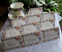
                                                                                                                        All placecards © Caspari

Tuesday, May 25, 2010

More Gothic Gratitude

                                                  "Toscana Fruit 4 Color Flat Paper"©K&Company, LLC

I am fortunate to work at a school full of wonderful and very generous families.  At the end of the year they sometimes surprise the staff with gifts of "greenery".  Rather than trying to write 40+ individual thank you notes, I like to make something a little special, reproduce it onto a nice background, and give one to each family.  On this one I was playing with ragged edges and line spacing as tight as I could make it.

Saturday, May 22, 2010

Stationery Portfolio - Tutorial


In my never-ending quest to find excuses to spend time at the calligraphy table,  a few years ago I came up with the idea of making monogrammed stationery for my friends and colleagues for the holidays.  The monograms are sketched quite large in pencil, then scanned and cleaned up in Photoshop Elements.  Here are a couple of samples:


I bought paper (and matching envelopes) with a semi-gloss finish and after cutting it to size, ran it through my inkjet.  Because of the surface, the ink was still wet as each page came out, so there was time to sprinkle it with clear embossing powder made for use with rubber stamps.  After tapping each to remove the extra powder, I set them all aside and then zapped them one-by-one with the heat gun, creating a raised surface over the printed monogram.


Presto!  Home thermography.

I added a blind-embossed oval by hand and scored the notes at the fold.  


The folios are cut from old Cavallini calendar pages with a template I designed (you could take apart and trace an old stationery folio for this).  


The folds are scored, then glued and clipped in place to dry.


Then the notes and envelopes are loaded inside...


...and the folios are finished off with paper strips and embellished with sealing wax.


Add a tag and you don't even need to giftwrap. 


Personalized, thermographed sets of stationery for little more than the cost of the paper!

Thursday, May 20, 2010

Sunday, May 16, 2010

Upcycled Party Favors, Upbeat Party

After a several-year hiatus, we finally were able to re-convene, and add to, our group of "Spring Birthday Ladies", which along the way has expanded to include "Honorary Spring Birthday Ladies", meaning pretty much anyone with a birthday and an evening to spend celebrating ourselves. 


Though most of us are half-century-ish in age, the group ranged from 24 to 84!  It was an extraordinary group of women who inspire me just by being.


For party favors I wrapped the lids of these boxes in some old stationery after doing a little quickie Spencerian and offhand flourishing.  I used Bill Lilly's Pelikan/powdered gum arabic recipe for the black, and Spectralite gold for the flourishes.  Though the box itself was the favor, I tucked a little bar of soap into each one to make sure no one was disappointed by an empty box!

Thursday, May 13, 2010

You've Got Mail


Just a pair of envelopes on the seat of my car, ready to be dropped in the mail on the way to work. Pen, ink, and a dab of sealing wax makes an everyday task more fun!

Monday, May 10, 2010

Capitalizing on Caps


Last Saturday I took a Friends of Calligraphy workshop with Judy Detrick, whose work I've long admired but whom I had never met. It was titled "Decorated Caps" and was a fun bouquet of techniques we were given to apply to our own letter designs. The Vs above were probably my most successful experiments.

We started by designing a letter and tracing it onto nice paper, then filling it in with gouache to get a feel for the medium.


For transferring the image to its final destination we used a reddish-brown powder called Armenian bole rubbed on the back of the tracing paper; it was magical and worked really well (and looks suspiciously like a makeup product sold in little terra cotta pots called Indian Earth, very big in the late 60s/early 70s). Seems like there's always some new (to me) "must-have" in the calligraphy/design world!

Besides the gouache we used watercolor, 00 brushes, tape, and .05 Pigma micron pens.


We experimented with framing the letters and filling them in with patterns.


This last one I just outlined and shaded with the Pigma pen, then painted it in.

Sunday, May 9, 2010

West Coast Saga


The first-ever West Coast Spencerian Saga with master penmen Michael Sull and Bill Kemp concluded over two weeks ago, and I'm still digesting it all.

It was a completely different experience from the longstanding Geneva-on-the-Lake Sagas, which are retreat-like in nature, held at the beautiful Lakehouse Inn on the south shore of Lake Erie in October when the air is crisp and the leaves are turning. Platt Rogers Spencer himself lived, taught, and is buried in Geneva.

In April the Berkeley venue, Castle in the Air, is busy, lively, and very connected to the Fourth Street goings-on, with lots of great places to eat and shop during breaks from the pen and ink. Art seems to be in the very air there. And... just a twenty-minute drive across the Richmond bridge from my house!


Both experiences are awesome: the former rich with penmanship history and the latter showing Spencerian's relevance in a contemporary setting.

Bill's digital overhead projector enabled this kind of detail! Sure beat struggling to watch over someone's shoulder. This is a comparison of the Nikko G and EF Principal nibs...


At the top is my final project: My life has a superb cast, but I can't figure out the plot, a quote I love and neglected to attribute to Ashleigh Brilliant. The script is Spencerian, of course, in Dr. Ph. Martin's Bleedproof White with embellishments in Spectralite gold. I used an EF Principal for the text and a Nikko G for the offhand flourishing.

Castle in the Air has published all of our final projects on its blog. I was amazed at the variety and ingenuity as the participants--who ranged from first-timers to twenty-year veterans, hobbyists to seasoned professionals--showcased the variety of techniques we had learned during the week from . It was a fun and lively group!

And the entire week we had the strangest feeling someone was watching us...


Sunday, May 2, 2010

Eleven for the Class of '10

Last weekend I met with the parents of Marin Waldorf's Class of 2010, while the students were on their eighth grade trip, to help them paint their children's diplomas. This one is all new elements (sometimes I re-use pieces from year to year, see the older ones here) and I'm kind of tickled with my first curved masthead and the little ribbon banner at the top. The lettering is Spencerian and blackletter.

It was an enthusiastic, talented and focused group! We had ten of eleven families represented, so one parent worked on two diplomas.


It was really fun to hear the conversation as snippets of news about their children were shared.


Notice the poster in the background above: a gloriously engrossed and illuminated poster of the Gettysburg Address! A little unexpected inspiration.


I wanted a picture of each painter, but my camera battery didn't cooperate. Everyone did a great job and I think they look beautiful!

LinkWithin

Related Posts with Thumbnails