Sunday, June 26, 2011

Generous Jo


One of the great things about the blogosphere, of course, is that we can virtually meet and get to know people who share our passions, however esoteric and obscure they may be (the passions, not the people).  Now I'm willing to bet there's a pretty small percentage of folks on the planet who even know what "dinky dips" are, let alone have figured out a way to make them more elegant and fun.  Enter the wonderful Jo Miller, calligrapher extraordinaire who recently surprised me with a gift of one of her ingenious creations.  "This holder is made from a piece of driftwood reclaimed from Lake Maurepas in southeast Louisiana," she says.  "It has a hand-rubbed finish which feels smooth as glass."  And, I might add, is so light that filling the dinky dip with ink probably doubles its weight.  Thank you, Jo!


Jo has made these available in her etsy shop, where she also has some darling ones made of reclaimed beadboard.  Dinky dips are a necessity for PPPs (Pointed Pen People)--so easy to see and control the amount of ink on the nib.  A wonderful gift for yourself or a calligraphy friend...and guaranteed to take your lettering up a notch!  At least that's what I'm hoping...

Friday, May 13, 2011

Resurrection


Most of the time when I look back through early pieces I find them, well, cringe-worthy.  So it was a pleasant surprise to come across this one, which isn't half bad, I think.  At the time I did not realize this was not Wendell Berry's entire poem, but had been excerpted in the version I had been carrying around for years.  The piece was an assignment from the wonderful Ann Miller in her "Calligraphy & Letterforms" class at the Academy of Art University in San Francisco, summer of 2004. [Ann still teaches the class, but only online. It's pricey (college credit) but an invaluable overview of the history of the artform.] The assignment was to use a curvelinear baseline with a quote of our choice.  It's monoline--probably various Speedball nibs, probably Sumi or Higgins Eternal ink.

That summer was a resurrection of sorts for me and glows in my memory.  I took the ferry across San Francisco Bay early each morning along with the self-described "worker bees" headed to the Financial District, had my ritual bagel and coffee on the boat, then walked a half-mile or so up Market Street to the classroom with my big portfolio and toolkit.  Virtually everyone else in the class was a twenty-something Graphic Design major who didn't quite "get" pen and ink, and couldn't wait to return to their digital lives, but I was enamored and obsessed.  

Here are the pieces of the poem I used in the piece:

Plant sequoias.
Say that your main crop is the forest
that you did not plant,
that you will not live to harvest.
Say that the leaves are harvested
when they have rotted into the mold...
Put your faith in the two inches of humus
that will build under the trees
every thousand years...Be joyful
though you have considered all the facts.
So long as women do not go cheap
for power, please women more than men.
Ask yourself: Will this disturb the sleep
of a woman near to giving birth?
Go with your love to the fields.
Lie easy in the shade...Swear allegiance
to what is highest your thoughts.
As soon as the generals and the politicos
can predict the motions of your mind,
lose it. Leave it as a sign
to mark the false trail, the way
you didn't go. Be like the fox
who makes more tracks than necessary,
some in the wrong direction.
Practice resurrection.
copyright © 1973 by Wendell Berry

Monday, May 9, 2011

Border Trouble

I recently learned the expression "border trouble", in this case referring not to immigration---nor to illuminated borders, like the one above---but rather to the sometimes-daunting obstacle between the idea for a piece and the point at which it begins to take shape.  Since I sometimes struggle mightily to move through that region, it helps me to think of it as just a transition, kind of a bothersome ordeal one has to go through to move into the pleasure on working on the piece once it starts to come to life, not to mention once it is finished.

It's school fundraiser season once again and I created this piece to raise some money for a good cause.  Artwork doesn't always do well in a silent auction but this was displayed nicely and went for a pretty penny!  The border outline came from the fabulous collection of the Graphics Fairy (you really need to go to that site, and bookmark it!);  I was able to take a little shortcut and print it onto tracing paper (rather than actually tracing it) and then transferred it to Arches 140 lb hot press with Armenian bole.

Because of the nature of the quote, I used more colors than I usually would have in the border.  The ink is Pelikan (with some powdered gum arabic added);  the rest of the design is gouache, pen, and 23K gold leaf.  I used a [left-handed] Brause 1.5mm nib;  the image is about 7.5" X 10.5".  I used my Logan Compact Mat Cutter (which has come in handy more times than I can count) to cut the mat, then popped it into a frame I picked up at Michael's half-price.  Ta-dah!

Friday, April 29, 2011

Cursive Catastrophe

Civil War Diary of Charles Wesley Foulk
Did you catch "The Case for Cursive" in yesterday's New York Times?  Apparently there is a new generation of children who not only cannot write in cursive, they can't read it either!  The biggest concerns seem to be that their block-lettered signatures will be easier to forge, and (rather secondarily) that the fine-motor-skill benefit of fluid writing may be lost.  Cursive, one elementary school principal posits, just may not be a "21st century skill".  Hmmmph.

But what I found the most distressing was the account of a 22-year-old and her cousin who found their late Granny's diary but couldn't read it. “ 'It was kind of cryptic,' [the young woman] said. She and the cousin tried to decipher it like one might a code, reading passages back and forth."

Seriously?  Are those of us who can read cursive going to become sought-after specialists, the dying breed able to interpret archival material---say, my great-great-grandfather's Civil War diary (the first page of which is pictured above)?  I'll admit Charles' authentic Spencerian (according to Michael Sull) handwriting is sometimes challenging to read, but that might be because he was writing with a dip pen in the freezing cold in his army tent.  I'm just saying...

On the upside, I see a new opportunity for parents here!  When our children were young, my husband and I used to resort to speaking a little Spanish when we didn't want them to know what we were saying (which worked well until their Spanish got way better than ours).  Nowadays mom and dad can leave each other notes in plain English that will just look like lovely scribbled designs to their offspring!

In any case, it seems that diary-snooping may be severely curtailed in the near future.  So go ahead and let'er rip in your journals, scribes!  No one now under twenty will ever know your secrets.

Wednesday, April 27, 2011

Enders Redux

The finished piece in my garden
Olive branch detail
Lettering detail
Halo detail
Once you've been to a place like Enders Island, there's no way you can stay away when you have another chance to go.  My trip last October was still vivid in my mind, and as it turned out, all five of us from that class--plus two new friends-- would be returning to take another class, "Illuminated Prayer on Vellum", with the inimitable Harvest Crittenden at St. Michael's Institute of the Sacred Arts on the island.  (BTW, check out Harvest's brand new Photoshop for Calligraphers online class, coming up in June!)

Sunrise the first morning was worth the trip!

View from my window
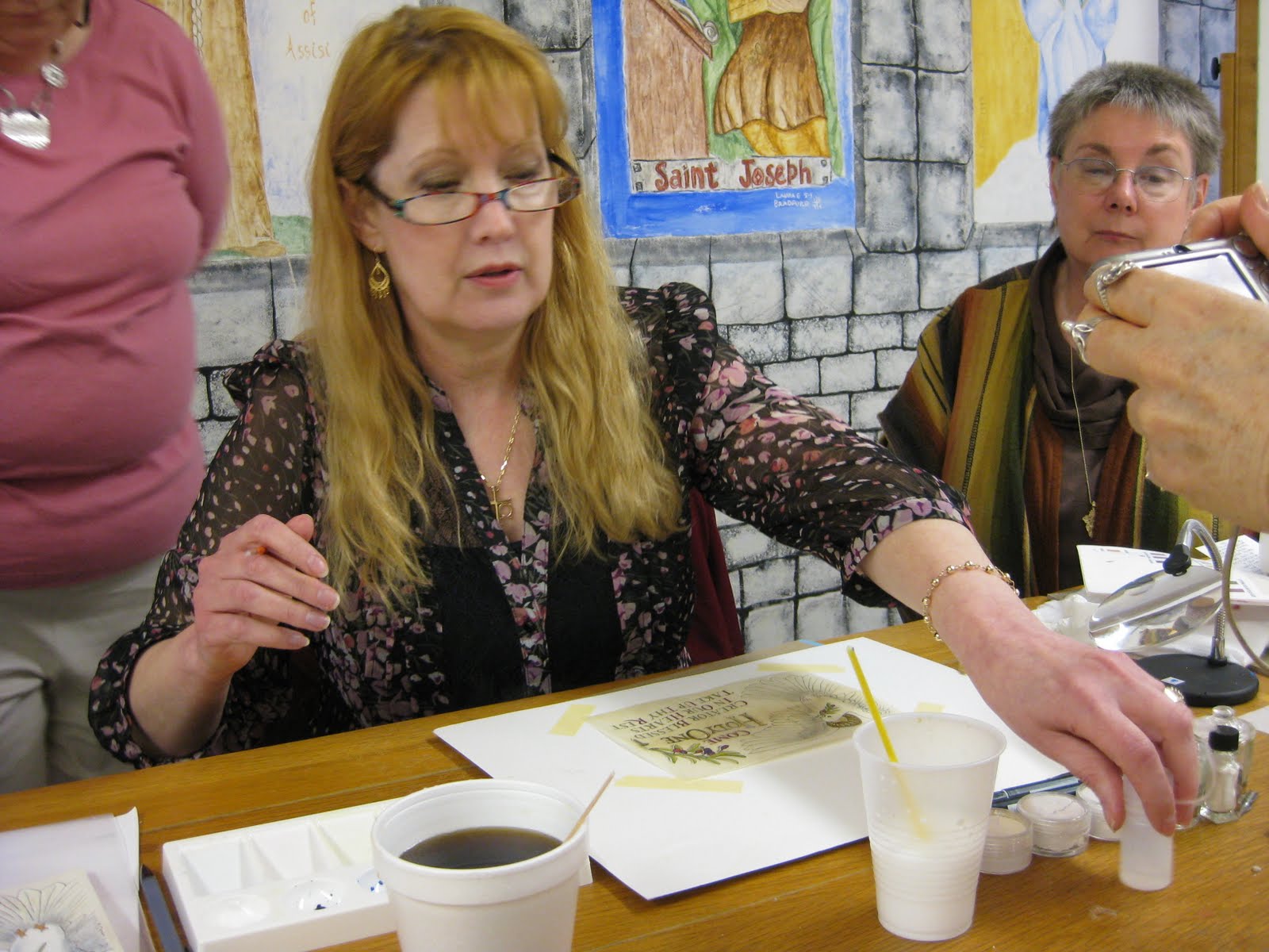
Harvest had created a lovely design with haloed dove, olive branches, and text, which we transferred onto sheets of vellum we had prepared with dental-grade pumice.  Over the four days of the class, we learned tips and techniques on gilding, shell gold, color theory (Harvest uses the CMYK palette), shadowing, and how much patience it takes to paint v-e-r-y tiny Roman drawn letters.
Harvest in action
Harvest demos feather detail
My piece in progress
As if that weren't enough, the chef outdid himself and each meal was more amazing than the last.  And for me, the camaraderie and exchange of knowledge and information was just as valuable as the workshop.  It was truly an amazing group of women.

The Class
Translucence
Farewell to Enders

Wednesday, April 20, 2011

Textured Letters with Barbara Close

Photo by Laura Bernabei

Some catching up to do!  The last weekend in March, the San Francisco Friends of Calligraphy sponsored a workshop by Barbara Close, whose store of techniques and enthusiasm seem absolutely boundless!  I always appreciate an organized, yet flexible teacher, and Barb was certainly all that.

Within the framework of creating textured letters, we played with watercolor, collage, paste paper, embossing, shadows and doodles. 

Photo by Laura Bernabei 
Photo by Laura Bernabei

Photo by Laura Bernabei
Photo by Henry Silva
We even made a lovely little folio in which to keep our creations.  (And always happy to find a use for my Czech glass button collection!)

Photo by Henry Silva
It was one of those more-process-than-product workshops where you leave with just a handful of creations but a veritable truckload of techniques and inspiration!

As an added bonus, Ruth Korch--my awesome table-mate and partner in crime--and I dashed over during lunch to the furniture sale in another building at Fort Mason and with Ruth's encouragement I scored this fabulous chair, covered abundantly with French calligraphy!

Photo by Laura Bernabei
All in all, a fun and relaxing way to spend a weekend.

Monday, April 11, 2011

Lemon Blackletter: Tim's Cake


I didn't get to see/taste this one in person since I was on my way back to beautiful Enders Island;  I dropped off the finished stencil to Wendy on my way out of town.  I do know that there was lemon, marzipan, buttercream, almonds and limoncello involved...yum...

LinkWithin

Related Posts with Thumbnails