Monday, December 24, 2012

Joy to the World!


This project took quite a while to gel, but yesterday it finally came together! I started several weeks ago with an actual scale diagram, taking in to account the television, the cabinet, two framed pieces of art, and even the beam. Oh, the obstacles we face as artists...


The script-y words took a different form--couldn't quite pull off the ribbon look. Of course, with chalk one can keep "fixing" things forever... Unlike the signboards for the school, this is real chalk (not Zig Posterman); my guests tend to be better behaved than the preschoolers. It also doesn't rain inside my house.


My husband kept telling me to add color to the "illuminated" R, but I was curious how far it could go with just black and white. What do you think?


Happy holidays to all, and keep looking for the joy!

Saturday, November 3, 2012

Shades of (Paynes) Gray

Rosemary Buczek design, my attempt at monochromatic painting...

In the "better-late-than-never" department, here is my post on the IAMPETH convention, which took place in Milwaukee in early August.


Me & Jane Farr
Best part by far:  hanging out every day with Jane Farr and basking in her talent, knowledge and all around wonderful-ness. We pretty much owned this corner of the hotel's spacious and beautiful bar.  Miss you, Jane!

Watching the masters in action was well worth the price of admission (to the conference, not the bar, although it wasn't unusual to see artists like incoming IAMPETH president Bill Kemp or Barbara Calzolari set up at a table in there...).  I also got a sneak peek at Harvest Crittenden's masterpiece certificate for IAMPETH president and conference chair Debi Zeinert in progress.  Here, she's gilding.  What Harvest can do in a hotel room in between classes and socializing, I can only dream of doing with a six-month sabbatical on a desert island!

As it happens, "A Study in Monochromatic Painting" with the inimitable Rosemary Buczek is the only class I took that Jane did not...and her excellent blog posts on the workshops of Joe Vitolo, Pat Blair, Kathy Milici, Barbara Calzolari will tell you all you need to know about the other classes I took!

Here's the article I wrote for Penman's Journal:

Rosemary Buczek


Rosemary Buczek:  A Study in Monochromatic Painting

By Friday morning of IAMPETH week I was thoroughly steeped in black and white, and wondering if perhaps I ought to have signed up for something involving color.  But “A Study in Monochromatic Painting” was my next scheduled class, and it turned out to be just the ticket:  while it is true we worked with just one tube of Winsor Newton Paynes Gray (and a touch of Dr. Ph. Martin’s Bleedproof White), the result was exquisitely colorful!
Rosemary Buczek sample sheet for workshop

Master Penman Rosemary Buczek guided us step-by-step with warm enthusiasm and expertise.  With the smallest dab of Winsor-Newton Paynes Gray--and an armload of brushes, rulers, pens, water containers, blotting towels, and other assorted supplies--forty eager IAMPETH members set out to embellish her beautiful rendering of the apt phrase, “The pen is mightier than the sword,” in the style of P.W. Costello and other early 20th century engrossing artists.

Rosemary Buczek design
Starting with the basic design, printed on very heavy hot press paper by Rosemary’s husband Steve, we re-outlined the shapes and letterforms with pen and waterproof ink.  Not only did this give definition to the design, it was a good way to acquaint oneself fully with all of its details.


With our pointed round watercolor brushes (#0 #1, #2), we created small sample sheets for ourselves, practicing painting the Paynes Gray in a variety of ways and creating levels of color saturation: dry into dry (for the darkest, most opaque shades) and dry into wet, wetter and wettest (for progressively more transparent tints).  We learned how to use the light of the paper to give further dimension to the design elements, and very helpfully, how to correct when the paint did not distribute itself as intended by rewetting and moving the color around. 

We then applied our newly-learned techniques to the study piece, beginning with the sections to be painted in the darkest shades and working toward the lighter areas.  Thanks to digital technology, we were able to watch in enlarged detail as Rosemary demonstrated the teasing of color from the darkest areas to the lightest, creating a background shadow that set off the piece handsomely.  Some letters were painted with the very palest tint, others with the deepest shade; both were embellished them with bits of white applied with ruling pen and pointed pen.
Rosemary Buczek design            
To be sure, Rosemary was able to de-mystify a technique which, with practice, will be simple and dramatic addition to this engrosser’s bag of tricks! It was a fun and inspiring class.

Rosemary Buczek design


end of article

The banquet on the final night was great fun, with Joe Carbone apparently playing "Where's Waldo?", appearing in every picture I took!


Me, Joe, JP Panter

Pat Daley, Joe, Harvest Crittenden

Joe & Harvest
Elizabeth Kenney & Joe with special party headpieces?
Next year:  Albuquerque.  Be there!

Thursday, October 25, 2012

To Have and to Hold


Bleedproof white lettering,  23 kt gold leaf dots, approx. 9" X 12"
Fourteen years ago we welcomed an exchange student from Germany into our family for a year.  It was in every way a wonderful experience, and we have managed to stay in touch across busy lives.  I had always promised my "German daughter" I would be there when she married, and last weekend, I was!  Here's the beautiful bride just before the fairy-tale wedding on the grounds of a historic castle.


But wait, there's more!  I'm somebody adorable's "American grandma"!


My two grown-up "babies" went along and I loved every minute.  It was a happy, happy occasion.


Tuesday, October 23, 2012

Chalk It Up

Oh my, how time does fly.  I have not posted since before IAMPETH...more on that later...but I have found a new way to keep my hand in the lettering world and fulfill some of my work duties at the same time. 

At the school where I work, the old easel we used to post notices finally gave up the ghost and could barely stand.  Happily, I found this "weatherized Oak Street A-Frame Sidewalk Sign" from billyBoards, intended for use with (also weatherproof) Zig Posterman markers. They withstand water, i.e. rain, and come off with Windex.


It's amazing, after a long day in the office, how much I unwind while sketching and chalking these messages!  It's become a (usually) Friday afternoon ritual.


It was a fun challenge to fit all the information on this one:


Since the theme of this one is "Simplicity Holidays", maybe the design ought to have been, well, simpler...


The board is two-sided, so I can be working on one side while still displaying the other. Happiness!

Tuesday, July 31, 2012

Envie Envy

This was my entry to the Graceful Envelope Contest, which is co-sponsored by the Washington Calligraphers Guild and the National Association of Letter Carriers.  The theme was the letter "D", and the entries had to be mailable and postmarked.  It's mostly pen (G-tec, Slicci, Pitt) and pencil.  The texture of the paper did some cool things to the shading, completely serendipitously.  The "D" is Finetec gold, burnished and tooled.  Of course, this scan was pre-mailing so I have no idea how it looked by the time it arrived!

The results are out and my amazingly talented friend Ruth Korch won Best in Show!!!  No doubt you've seen some of her other winning envelopes online and on magazine covers, like this:

Ruth Korch

and this:
Ruth Korch

Ruth's, and the other winning envelopes will be posted here beginning August 8, and for those of you in the DC area, on display beginning in September in the lobby of the National Association of Letter Carriers building.  Can't wait to see the fantastic array of creativity this event elicits!  Congrats to all for postal awesomeness.

Thursday, July 19, 2012

Summer Fun in the Family Room

"The Perfect is the enemy of the Good."  ~Voltaire
Much to the amusement of friends and family, I've been at it again, scribbling on the walls!  This quote had been rattling around in my brain for a while, and seemed a propos after coming away somewhat intimidated by the hundreds of more-accomplished calligraphers at Calligraphy Northwest last month.  Not that those inspirational folks are the enemy, mind you--I am perfectly capable of taking on that role for myself--but for me, it's an important reminder that just plain "good" is something to feel, well, good about.

I thought I'd share a bit of process this time.  I started with a little doodle on a graph-paper sticky note;  as usual, television = design challenge.


Although the finished project is done with dime store chalk, for some reason it was hard for me to get started with such a blunt tip.  Enter two handy tools, both marketed primarily to quilters:


The Fons & Porter is ultra-fine chalk--about the size of pencil lead--and happens to be sold by Paper & Ink Arts for lining dark envelopes.  The bolder "pen" is made by Dritz and I picked it up at Joann Fabrics.  It comes with a little box of white and colored "leads"! Joy!

I started out sketching with the Fons & Porter...


Then defined lines a little more with the chalk pen:


Gradually I filled in and tweaked:


As you can see, there's still some clean-up to do, but I kind of like the chalkiness of it all.  By the way, this wall is painted with plain old latex (hadn't actually planned to be writing on it back then), which is getting a bit trashed by all this foolery.  My "buddy" Martha has a recipe for homemade chalkboard paint, and some great ideas for using it, here.  Check it out!

Friday, July 13, 2012

Calligraphy Northwest: Dynamic Duo

Julian Waters & Carl Rohrs, June 2012
Last post I mentioned that Reed College's Eliot Hall was where Fr. Edward Catich cut the lintel stones, and Lloyd Reynolds taught his calligraphy classes back in the day.
Eliot Hall, Reed College, Portland OR
So there, in the very same lecture hall---well, half of it, the other half is now the college president's office--two present-day calligraphic luminaries held forth with a course titled "20th Century Inspirations and 21st Century Techniques" during the week of Calligraphy Northwest in June.  Julian Waters and Carl Rohrs started out by giving us what clearly had been a labor of love for each of them:  a total of 248 pages, bound in two volumes, of their own work alongside that of their "inspirateurs", some familiar, some obscure (at least to me). There is enough material here for a lifetime of study!  If my house ever catches fire, I know what I'll be grabbing on the way out the door!
Workbooks by Carl Rohrs (top) &  Julian Waters (bottom) for CNW
Most of the time I was so busy listening, observing, absorbing and experimenting that I took very few photos.  To be honest, a lot of it is just now sinking in.
Julian demos while Carl comments
Contrast!

It's all in the details!

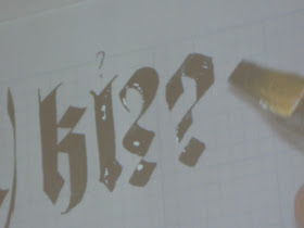
This wasn't a product-oriented class, but a rather stream-of-consciousness romp through big ideas and tiny details--which seem now either too vast or too small to write about here.  In what they had predicted would be a "somewhat improvisatory" presentation, it was fascinating to listen to Carl & Julian's banter, filled with seriously encyclopedic knowledge of fonts and all things calligraphic. For example, did you know that Rudolf Koch had designed minuscules for his1920s Neuland typeface, but they were abandoned?  Here's my attempt at approximation:


We worked with broad nib, automatic pen, folded nib, ruling pen, flat brush and pointed brush. Here we were trying to eliminate as much negative space as possible in our blackletter:


That afternoon we switched to pointed brush and my head almost exploded!  I won't trouble you with illustrations of my feeble attempts.

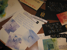
At the end of the week there was a "show and share" in the dining hall.  What a feast!


I apologize for the lack of attribution--way too many to keep track of.

It was announced that in addition to the 2013 conference at Colorado College next summer, the 2015 conference will take place in the Bay Area!  Save the dates!